Dialogs
Dialogs are a great way to get the user to make a decision or enter some information. They are also a great way to display information to the user. A set of pre-built dialogs are provided by UraniumUI such as asking multiple or single selection, confirmation and text input. UraniumUI provides an abstraction layer for dialogs with IDialogService. UraniumUI has 2 different popups implementations which are Community Toolkit and Mopups.

You should pick one of them and add it to your project. UraniumUI will use the popup implementation that you added to your project. If you don't add any popup implementation, UraniumUI will use Modal pages instead of popups.
Available packages
UraniumUI.Dialogs.CommunityToolkitUraniumUI.Dialogs.Mopups
UraniumUI has a default dialog implementation. You can use it without adding any additional package. It uses built-in MAUI Navigation and pushes modal pages to the navigation stack to show dialogs like popups.
Note
It may conflict if your project has custom navigation that uses Modal Pages. In that case, you should use one of the popup implementations like Mopups or Community Toolkit.
Types
There are 6 types of dialogs in UraniumUI package. They are:
CheckBox Prompt- For multiple selectionRadioButton Prompt- For single selectionConfirmation- For yes/no decisionsText Prompt- For text inputProgress- For showing progressView- For displaying custom viewsForm- For displaying form-based dialogs
Usage Patterns
Extension Methods
The simplest way to use dialogs is through extension methods:
public partial class MainPage : ContentPage
{
    private async void ShowDialog_Clicked(object sender, EventArgs e)
    {
        var result = await this.DisplayCheckBoxPromptAsync(
            "Select Options",
            new[] { "Option 1", "Option 2", "Option 3" });
    }
}
Dependency Injection
For better testability and maintainability, inject IDialogService:
public partial class MainPage : ContentPage
{
    private readonly IDialogService _dialogService;

    public MainPage(IDialogService dialogService)
    {
        InitializeComponent();
        _dialogService = dialogService;
    }

    private async void ShowDialog_Clicked(object sender, EventArgs e)
    {
        var result = await _dialogService.DisplayCheckBoxPromptAsync(
            "Select Options",
            new[] { "Option 1", "Option 2", "Option 3" });
    }
}
Important
Injecting IDialogService is highly recommended. It'll make your code more testable and make the dialogs library easily swappable.
RadioButton Prompt
RadioButton prompt can be used to get a single selection input from user. It returns the selected option. It can be used with strings or objects. If you use objects, you can use DisplayMember parameter to specify the property of the object to be displayed or your object should override ToString() method.
Usage
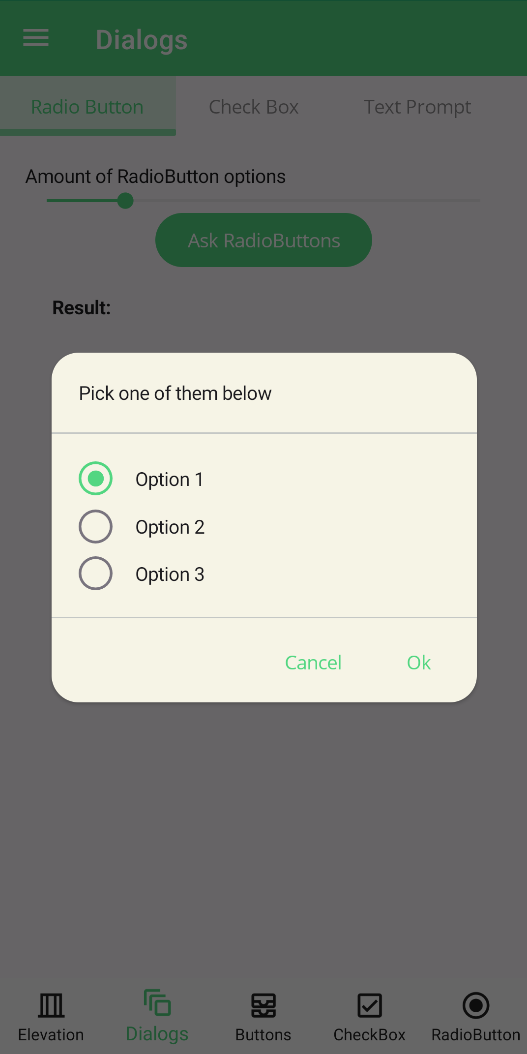
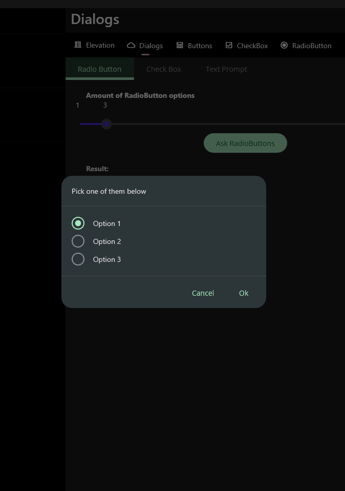
The easiest way to use RadioButton prompt is to pass a string array to it. It will return the selected option as a string.
private async void Button_Clicked(object sender, EventArgs e)
{
    var result = await this.DisplayRadioButtonPromptAsync(
            "Pick some of them below",
            new [] {"Option 1", "Option 2", "Option 3"});
}
| Light | Dark |
|---|---|
 |
 |
Parameters
DisplayRadioButtonPromptAsync method has 6 parameters. They are:
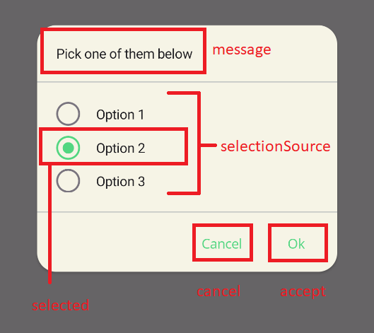
message: Message of the dialog. It'll be rendered top of the dialog.selectionSource: Selection source of the dialog. It can be a string collection or an object collection. If you use objects, you can usedisplayMemberparameter to specify the property of the object to be displayed or your object should overrideToString()method.selected: Selected item of the dialog. It'll be automatically selected when dialog is shown.accept: Accept button text of the dialog. It'll be rendered as the accept button text.cancel: Cancel button text of the dialog. It'll be rendered as the cancel button text.displayMember: Display member of the object. It'll be used to specify the property of the object to be displayed or your object should overrideToString()method.
private async void Button_Clicked(object sender, EventArgs e)
{
    var options = new List<MyOption>()
    {
        new MyOption() { Name = "Option 1", Description = "Description 1" },
        new MyOption() { Name = "Option 2", Description = "Description 2" },
        new MyOption() { Name = "Option 3", Description = "Description 3" },
    };
    var result = await this.DisplayRadioButtonPromptAsync(
            "Pick some of them below",
            options,
            options[1],
            "OK",
            "Cancel",
            "Name");

    await this.DisplayAlert("Result", result.Name, "OK");
}
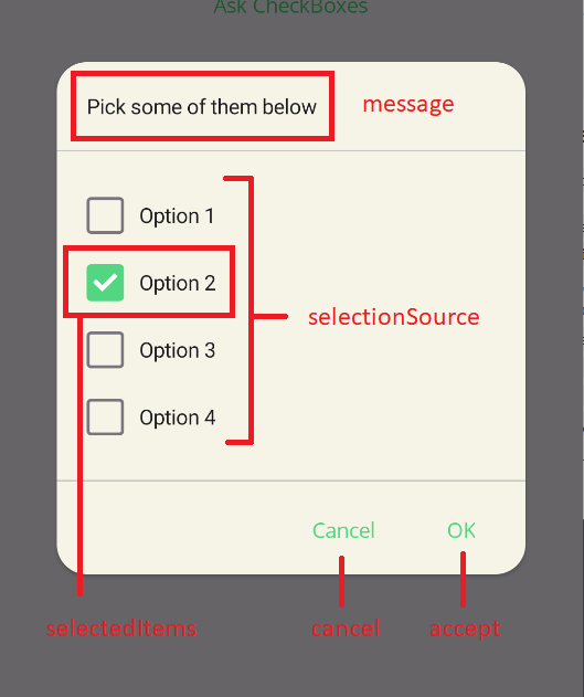
CheckBox Prompt
CheckBox prompt can be used to get a multiple selection input from user. It returns the selected options. It can be used with strings or objects. If you use objects, you can use DisplayMember parameter to specify the property of the object to be displayed or your object should override ToString() method.
| Light | Dark |
|---|---|
 |
 |
Usage
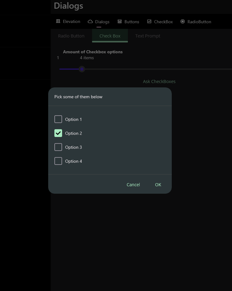
The easiest way to use CheckBox prompt is to pass a string array to it. It will return the selected options as a string array.
private async void Button_Clicked(object sender, EventArgs e)
{
    var result = await this..DisplayCheckBoxPromptAsync(
            "Pick some of them below",
            new [] {"Option 1", "Option 2", "Option 3", "Option 4",});
}
Parameters
DisplayCheckBoxPromptAsync method has 6 parameters. They are:
message: Message of the dialog. It'll be rendered top of the dialog.selectionSource: Selection source of the dialog. It can be a string collection or an object collection. If you use objects, you can usedisplayMemberparameter to specify the property of the object to be displayed or your object should overrideToString()method.selectedItems: Selected items of the dialog. They'll be automatically selected when dialog is shown.accept: Accept button text of the dialog. It'll be rendered as the accept button text.cancel: Cancel button text of the dialog. It'll be rendered as the cancel button text.displayMember: Display member of the object. It'll be used to specify the property of the object to be displayed or your object should overrideToString()method.
private async void Button_Clicked(object sender, EventArgs e)
{
    var options = new List<MyOption>()
    {
        new MyOption() { Name = "Option 1", Description = "Description 1" },
        new MyOption() { Name = "Option 2", Description = "Description 2" },
        new MyOption() { Name = "Option 3", Description = "Description 3" },
        new MyOption() { Name = "Option 3", Description = "Description 4" },
    };

    var result = await this.DisplayCheckBoxPromptAsync(
            "Pick some of them below",
            options,
            new [] { options[1] },
            "OK",
            "Cancel",
            "Name");

    await this.DisplayAlert("Result", string.Join(", ", result.Select(x => x.Name)), "OK");
}
Styling
The shared dialog APIs do not expose per-prompt checkbox styling. Use app-level styles for the checkbox type used by your dialog implementation, or build a custom view with DisplayViewAsync when one dialog needs custom visuals.
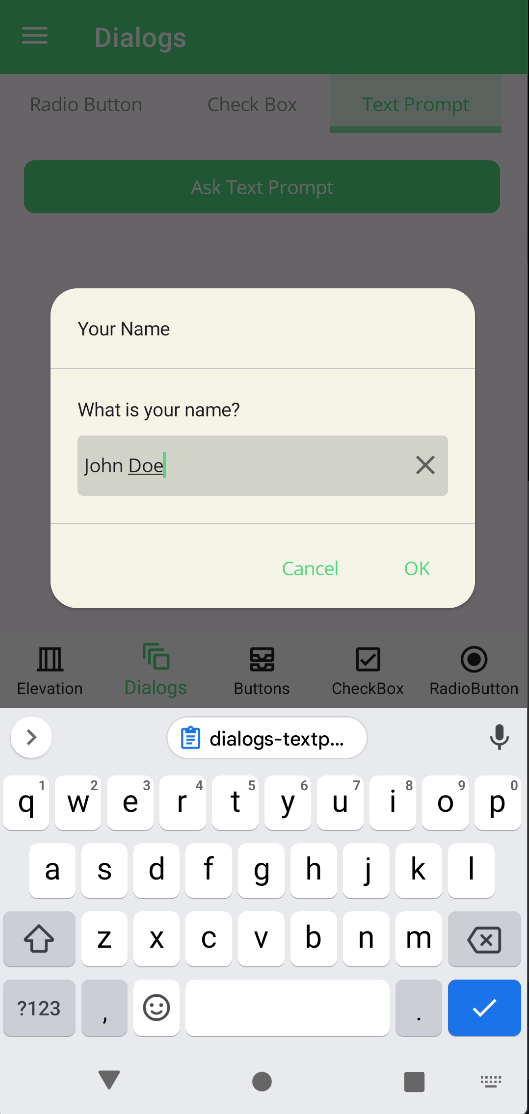
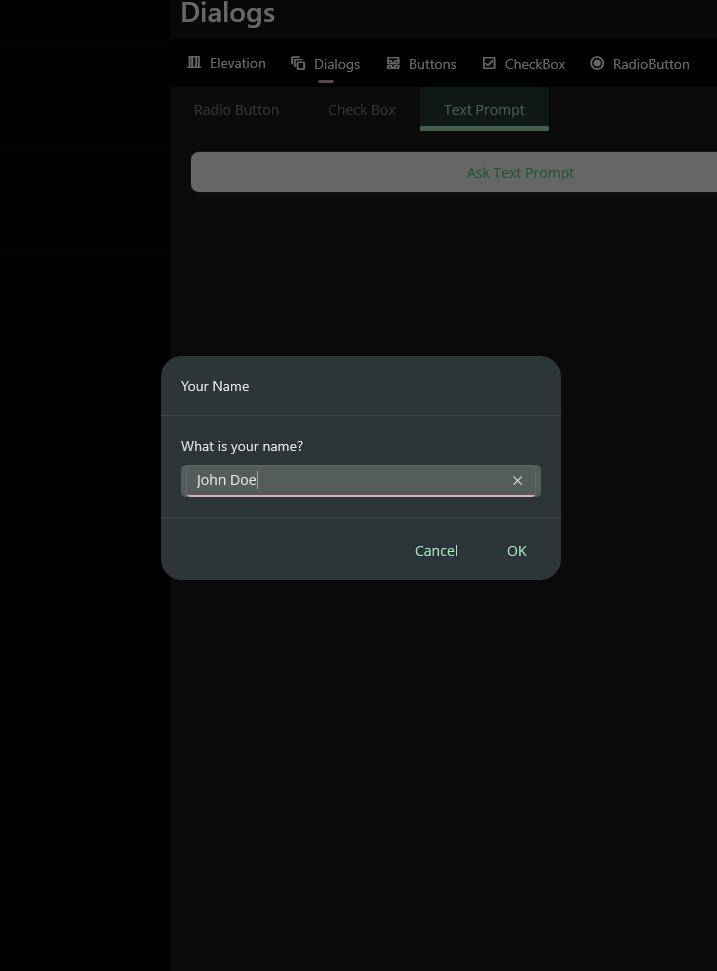
Text Prompt
Text prompt can be used to get a text input from user. It returns the entered text. All parameters are same with MAUI default DisplayPromptAsync method.
| Light | Dark |
|---|---|
 |
 |
private async void Button_Clicked(object sender, EventArgs e)
{
    var result = await this.DisplayTextPromptAsync("Your Name", "What is your name?", placeholder: "Uvuvwevwevwe...Osas");

    await DisplayAlert("Result:", result, "OK");
}
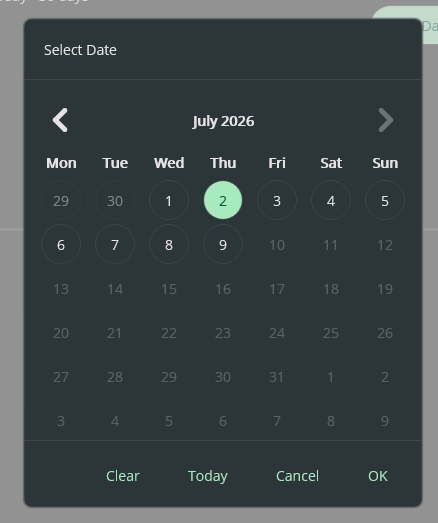
Date Prompt
Date prompt can be used to select a nullable date with the custom CalendarView. It supports OK, Cancel, Clear, and Today actions. Tap the month/year header to jump by year, which is useful for birthdates and other historical dates.
private DateTime? selectedDate = DateTime.Today;

private async void Button_Clicked(object sender, EventArgs e)
{
    selectedDate = await this.DisplayDatePromptAsync(
        "Select Date",
        selectedDate,
        minimumDate: DateTime.Today.AddDays(-30),
        maximumDate: DateTime.Today.AddDays(30));

    await DisplayAlert("Result:", selectedDate?.ToString("d") ?? "null", "OK");
}
DisplayDatePromptAsync returns the selected date when OK is pressed. Clear closes the dialog and returns null. Cancel closes the dialog and returns the original selectedDate, so assigning the result back to the same variable does not mutate the caller state.
Manual verification steps for each dialog provider:
- Open the Dialogs demo page.
- Select each implementation from the Implementation selector.
- Open Date Prompt and verify OK returns the selected date.
- Select Clear and verify the result becomes
null. - Change the visible selection, select Cancel, and verify the previous result is preserved.
- Select Today and verify today is selected when it is within the min/max range.
View
View dialogs can display custom MAUI content. Use the one-button overload when the dialog is informational. Use the OK/Cancel overload when the caller needs to know whether the user accepted or discarded changes.
private async void Button_Clicked(object sender, EventArgs e)
{
    var content = new VerticalStackLayout
    {
        Children =
        {
            new HorizontalStackLayout
            {
                Children =
                {
                    new CheckBox(),
                    new Label { Text = "Yes" }
                }
            },
            new HorizontalStackLayout
            {
                Children =
                {
                    new CheckBox(),
                    new Label { Text = "No" }
                }
            },
            new Button { Text = "Open Camera" }
        }
    };

    var accepted = await DialogService.DisplayViewAsync(
        "Custom Content",
        content,
        "Save",
        "Cancel");

    if (accepted)
    {
        // Save changes from the custom content.
    }
}
DisplayViewAsync(title, content, okText, cancelText) returns true when the OK button is pressed and false when the Cancel button is pressed. The button labels are explicit to avoid ambiguity with the existing one-button overload.
Progress
Progress dialog can be used to show a progress dialog to the user. There are 2 types of progress dialogs in UraniumUI. They are blocking and cancellable. Blocking progress dialog will block the UI until it's closed. Cancellable progress dialog will have a cancel button to allow user to cancel the operation. It returns an IDisposable and it'll be visible until you dispose it. You can use it with using statement to show a progress dialog.
private async void Button_Clicked(object sender, EventArgs e)
{
    using (await DialogService.DisplayProgressAsync("Loading", "Work in progress, please wait..."))
    {
        // Indicate a long running operation
        await Task.Delay(5000);
    }
}
| Light | Dark |
|---|---|
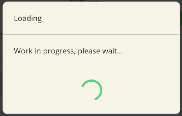 |
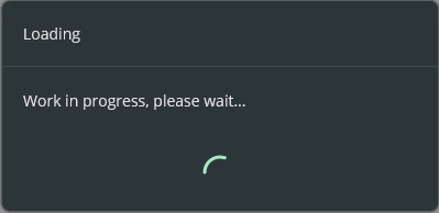 |
private async void Button_Clicked(object sender, EventArgs e)
{
    using (await DialogService.DisplayCancellableProgressAsync("Loading", "Work in progress, please wait...", "Cancel"))
    {
        // Indicate a long running operation
        await Task.Delay(5000);
    }
}
| Light | Dark |
|---|---|
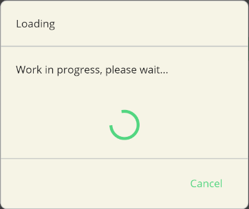 |
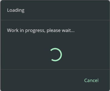 |
Handling Cancellation
You can handle the cancellation of the progress dialog by checking the IsCancellationRequested property of the CancellationToken parameter of the DisplayCancellableProgressAsync method.
- You can handle with registering an action to the
CancellationToken.private async void Button_Clicked(object sender, EventArgs e) { var cts = new CancellationTokenSource(); cts.Token.Register(() => { // Handle cancellation Console.WriteLine("Progress dialog cancelled"); }); using (var progress = await DialogService.DisplayCancellableProgressAsync( "Loading", "Work in progress, please wait...", "Cancel", cts)) { // Indicate a long running operation await Task.Delay(5000); } } - You can handle at the end of the operation by checking the
IsCancellationRequestedproperty of theCancellationToken.private async void Button_Clicked(object sender, EventArgs e) { var cts = new CancellationTokenSource(); using (var progress = await DialogService.DisplayCancellableProgressAsync( "Loading", "Work in progress, please wait...", "Cancel", cts)) { // Indicate a long running operation await Task.Delay(5000); } if (cts.IsCancellationRequested) { // Handle cancellation Console.WriteLine("Progress dialog cancelled"); } else { // Handle completion Console.WriteLine("Progress dialog completed"); } } - You can even cancel the long running Task operation when user cancels the operation:
private async void Button_Clicked(object sender, EventArgs e)
{
    var cts = new CancellationTokenSource();

    using (var progress = await DialogService.DisplayCancellableProgressAsync(
        "Loading", "Work in progress, please wait...", "Cancel", cts))
    {
        try
        {
            // Indicate a long running operation
            await Task.Delay(5000, cts.Token);
        }
        catch (TaskCanceledException)
        {
            // Handle cancellation
            Console.WriteLine("Progress dialog cancelled");
        }
    }
}
Customization
UraniumUI dialogs can be customized in several ways:
Dialog Options
You can customize the appearance and behavior of dialogs by configuring DialogOptions:
builder.Services.Configure<DialogOptions>(options =>
{
    // Custom backdrop color
    options.GetBackdropColor = () => Colors.Black.WithAlpha(0.7f);

    // Custom header
    options.GetHeader = (title) => new Label
    {
        Text = title,
        FontSize = 24,
        Margin = new Thickness(20)
    };

    // Custom footer
    options.GetFooter = (buttons) => new StackLayout
    {
        Orientation = StackOrientation.Horizontal,
        Children = buttons.Select(b => new Button
        {
            Text = b.Key,
            Command = b.Value
        }).ToList()
    };

    // Custom divider
    options.GetDivider = () => new BoxView
    {
        HeightRequest = 2,
        Color = Colors.Gray
    };

    // Custom effects
    options.Effects = new List<Func<Effect>>
    {
        () => new ShadowEffect(),
        () => new RippleEffect()
    };
});
Styling
Dialogs support Material Design styling through style classes:
SurfaceContainer- Applies surface container stylingRounded- Applies rounded cornersDivider- Styles the dividerDialog.Button0- Styles the first buttonDialog.Button1- Styles the second buttonTextButton- Applies text button styling
You can override these styles in your application's resources:
<ResourceDictionary>
    <Style TargetType="Button" Class="Dialog.Button0">
        <Setter Property="TextColor" Value="{StaticResource Primary}" />
        <Setter Property="FontAttributes" Value="Bold" />
    </Style>

    <Style TargetType="Button" Class="Dialog.Button1">
        <Setter Property="TextColor" Value="{StaticResource Error}" />
    </Style>
</ResourceDictionary>
Service Registration
UraniumUI provides different ways to register and use dialog services:
Default Implementation
The default implementation uses MAUI's built-in navigation system. No additional registration is required:
builder.Services.AddUraniumUI();
Mopups Implementation
To use Mopups as the dialog implementation:
builder.Services.AddUraniumUI();
builder.Services.AddMopupsDialogs();
Community Toolkit Implementation
To use Community Toolkit as the dialog implementation:
builder.Services.AddUraniumUI();
builder.Services.AddCommunityToolkitDialogs();
Custom Dialog Service
You can create a custom dialog service by implementing IDialogService:
public class CustomDialogService : IDialogService
{
    // Implement interface methods
}

// Register in DI container
builder.Services.AddSingleton<IDialogService, CustomDialogService>();