AutoCompleteTextField
AutoCompleteTextField is a text field that provides suggestions as you type. It's a powerful input control that helps users quickly find and select items from a predefined list.
Usage
AutoCompleteTextField is included in the UraniumUI.Material.Controls namespace. You should add it to your XAML like this:
xmlns:material="http://schemas.enisn-projects.io/dotnet/maui/uraniumui/material"
Then you can use it in a page like this:
<material:AutoCompleteTextField Title="Fruit">
    <material:AutoCompleteTextField.ItemsSource>
        <x:String>Apple</x:String>
        <x:String>Orange</x:String>
        <x:String>Banana</x:String>
        <x:String>Strawberry</x:String>
        <x:String>Watermelon</x:String>
        <x:String>Cherry</x:String>
        <x:String>Blueberry</x:String>
        <x:String>Blackberry</x:String>
        <x:String>Pineapple</x:String>
        <x:String>Coconut</x:String>
        <x:String>Apricot</x:String>
        <x:String>Avocado</x:String>
        <x:String>Plum</x:String>
        <x:String>Fig</x:String>
        <x:String>Grape</x:String>
        <x:String>Guava</x:String>
        <x:String>Lemon</x:String>
        <x:String>Lime</x:String>
        <x:String>Mango</x:String>
        <x:String>Passion Fruit</x:String>
        <x:String>Peach</x:String>
        <x:String>Pear</x:String>
        <x:String>Pomegranate</x:String>
        <x:String>Raspberry</x:String>
        <x:String>Tomato</x:String>
    </material:AutoCompleteTextField.ItemsSource>
</material:AutoCompleteTextField>
| Light | Dark |
|---|---|
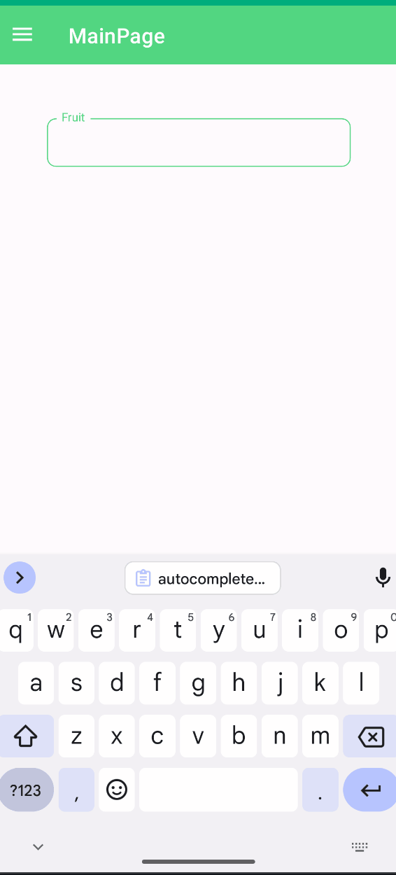 |
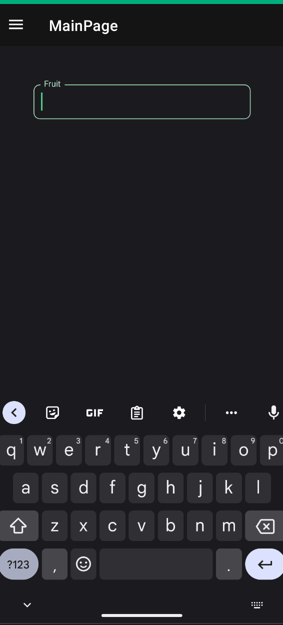 |
Properties
Basic Properties
Title(string): The label text displayed above the text fieldText(string): The current text value of the fieldSelectedText(string): The text value when an item is selected from suggestionsItemsSource(IList): The collection of items to show as suggestions Threshold(int): Minimum number of characters to type before showing suggestions (default: 2)TextColor(Color): The color of the input textAllowClear(bool): Whether to show a clear button when text is entered (default: false)
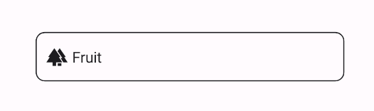
Icon
AutoCompleteTextFields support setting an icon on the left side of the control. You can set the icon by setting the Icon property. The icon can be any ImageSource object. FontImageSource is recommended as Icon since its color can be changed when focused.
<material:AutoCompleteTextField
    Title="Fruit"
    Icon="{FontImageSource FontFamily=MaterialRegular, Glyph={x:Static m:MaterialRegular.Forest}}"/>
Validation
Validation logic is exactly same with InputKit Validations.
AutoCompleteTextFields support validation. You can define validations by using the Validations property. Validation is triggered when the text changes. If the validation fails, the error message is displayed. You can set the error message by setting the ErrorMessage property.
See also DataAnnotations
<material:AutoCompleteTextField>
    <validation:RequiredValidation />
</material:AutoCompleteTextField>
FormView Compatibility
AutoCompleteTextField is fully compatible with FormView. You can use it inside a FormView and it will work as expected.
<input:FormView Spacing="20">
    <material:AutoCompleteTextField
        Title="Fruit"
        Text="{Binding FruitText}"
        ItemsSource="{Binding FruitSuggestions}">
        <material:AutoCompleteTextField.Validations>
            <validation:RequiredValidation />
        </material:AutoCompleteTextField.Validations>
    </material:AutoCompleteTextField>

    <Button StyleClass="FilledButton"
            Text="Submit"
            input:FormView.IsSubmitButton="True"/>
</input:FormView>
Dynamic Suggestions Example
You can also bind to a dynamic source of suggestions. Here's an example using Google's search suggestions:
<material:AutoCompleteTextField
    Title="Search"
    AllowClear="true"
    ItemsSource="{Binding Suggestions}"
    Text="{Binding SearchText}" />
public class SearchViewModel : UraniumBindableObject
{
    private string searchText;
    public string SearchText
    {
        get => searchText;
        set => SetProperty(ref searchText, value, doAfter: UpdateSuggestions);
    }

    private IEnumerable<string> suggestions;
    public IEnumerable<string> Suggestions
    {
        get => suggestions;
        set => SetProperty(ref suggestions, value);
    }

    private async void UpdateSuggestions(string value)
    {
        // Update suggestions based on the search text
        Suggestions = await GetSuggestionsAsync(value);
    }
}
Events
TextChanged: Raised when the text value changesCompleted: Raised when the user completes the input (e.g., presses Enter)