TextField
Text fields let users enter and edit text. It is an abstraction on MAUI Level for material inputs.
Usage
TextField is included in the UraniumUI.Material.Controls namespace. You should add it to your XAML like this:
xmlns:material="http://schemas.enisn-projects.io/dotnet/maui/uraniumui/material"
Then you can use it like this:
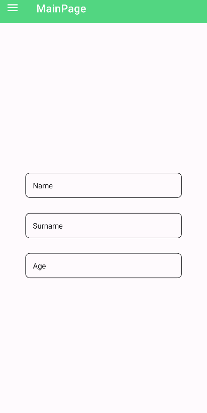
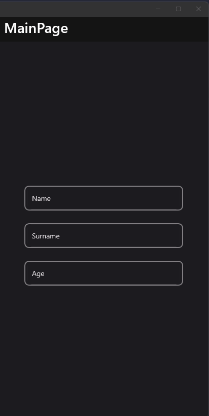
<material:TextField Title="Name" />
<material:TextField Title="Surname" />
<material:TextField Title="Age" Keyboard="Numeric" />
| Light | Dark |
|---|---|
 |
 |
Properties
Text Input Properties
Text- Gets or sets the text value of the TextFieldTextColor- Gets or sets the color of the textKeyboard- Gets or sets the keyboard type (e.g., Default, Numeric, Email)IsPassword- Gets or sets whether the TextField should mask its textMaxLength- Gets or sets the maximum length of text allowedIsTextPredictionEnabled- Gets or sets whether text prediction is enabledCharacterSpacing- Gets or sets the spacing between charactersHorizontalTextAlignment- Gets or sets the horizontal alignment of the text
Behavior Properties
AllowClear- Gets or sets whether a clear button is shown to clear the textDisallowClearButtonFocus- Gets or sets whether the clear button can receive focusSelectAllTextOnFocus- Gets or sets whether all text should be selected when the field receives focusIsReadOnly- Gets or sets whether the TextField is read-onlyReturnType- Gets or sets the return key typeReturnCommand- Gets or sets the command to execute when the return key is pressedReturnCommandParameter- Gets or sets the parameter for the return command
Selection Properties
SelectionLength- Gets or sets the length of the selected textCursorPosition- Gets or sets the position of the cursorSelectionHighlightColor- Gets or sets the color of the text selection highlight
Events
TextChanged- Occurs when the text value changesCompleted- Occurs when the user completes the text input (e.g., presses return)
Methods
ClearValue()- Clears the text value of the TextFieldSelectAllText()- Selects all text in the TextFieldDisplayValidation()- Displays validation resultsResetValidation()- Resets the validation state and clears the text
Icon
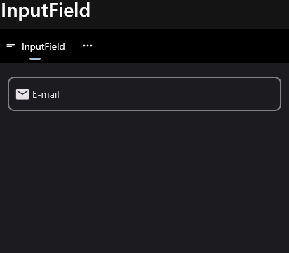
TextFields support setting an icon on the left side of the control. You can set the icon by setting the Icon property. The icon can be any ImageSource object. FontImageSource is recommended as Icon since its color can be changed when focused.
 <material:TextField
    Title="E-mail"
    Icon="{FontImageSource FontFamily=MaterialRegular, Glyph={x:Static m:MaterialRegular.Email}}"/>
| Light | Dark |
|---|---|
 |
 |
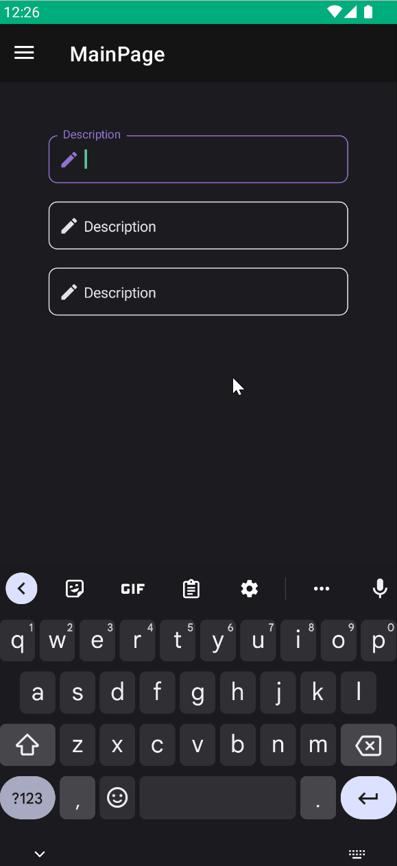
AccentColor
The color that is used to fill border and icon of control when it's focused. You can change it by setting AccentColor property of the control.
 <material:TextField
    Title="Description"
    Icon="{FontImageSource FontFamily=MaterialRegular, Glyph={x:Static m:MaterialRegular.Edit}}"
    AccentColor="DeepSkyBlue"/>
AllowClear
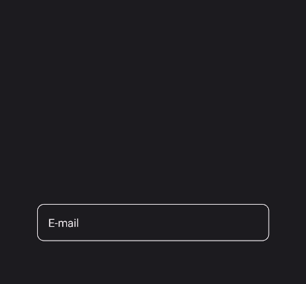
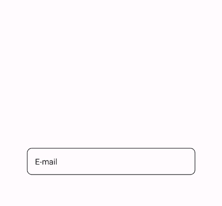
TextFields support clearing the text by setting the AllowClear property to true. Default value is false.
 <material:TextField
    Title="E-mail"
    AllowClear="True"/>
| Dark | Light |
|---|---|
 |
 |
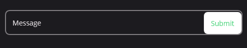
Attachments
Attachments are additional controls that can be placed inside the control. They are placed on the end of the control (right-side on LTR). You can add attachments by using Attachments property. It is a collection of View objects.
<material:TextField Title="Message">
    <material:TextField.Attachments>
        <Button Text="Submit" />
    </material:TextField.Attachments>
</material:TextField>
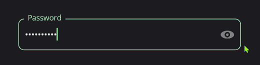
Password Show/Hide
The TextFieldPasswordShowHideAttachment provides a toggle button to show/hide password text. It automatically updates its icon based on the password visibility state.
<material:TextField Title="Password" IsPassword="True">
    <material:TextField.Attachments>
        <material:TextFieldPasswordShowHideAttachment />
    </material:TextField.Attachments>
</material:TextField>
The attachment automatically:
- Toggles between show/hide icons
- Updates the TextField's
IsPasswordproperty - Maintains proper styling and layout
Validation
It implements [InputKit Validations](https://enisn-projects.io/docs/en/inputkit/latest/components/
controls/FormView#validations) feature and supports validation through the Validations property. Validations can be added in two ways:
- Using the
Validationsproperty:
<material:TextField Title="Email">
    <material:TextField.Validations>
        <validation:RequiredValidation />
        <validation:RegexValidation Pattern="{x:Static input:AdvancedEntry.REGEX_EMAIL}" Message="Invalid email address" />
    </material:TextField.Validations>
</material:TextField>
- Directly as child elements:
<material:TextField Title="Email">
    <validation:RequiredValidation />
    <validation:RegexValidation Pattern="{x:Static input:AdvancedEntry.REGEX_EMAIL}" Message="Invalid email address" />
</material:TextField>
FormView Compatibility
TextField is fully compatible with FormView. You can use it inside a FormView and it will work as expected.
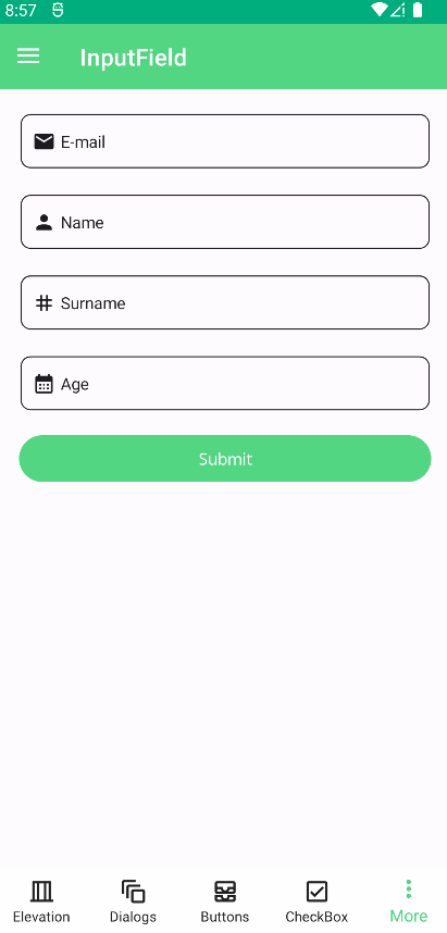
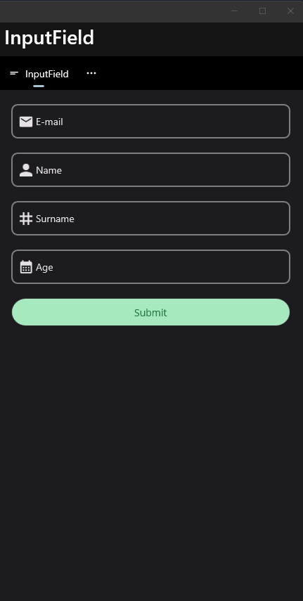
 <input:FormView Spacing="20">

    <material:TextField Title="E-mail" Icon="{FontImageSource FontFamily=MaterialRegular, Glyph={x:Static m:MaterialRegular.Email}}">
        <validation:RequiredValidation />
        <validation:RegexValidation Pattern="{x:Static input:AdvancedEntry.REGEX_EMAIL}" Message="Invalid email address" />
    </material:TextField>

    <material:TextField Title="Name" Icon="{FontImageSource FontFamily=MaterialRegular, Glyph={x:Static m:MaterialRegular.Person}}">
        <validation:LettersOnlyValidation AllowSpaces="True" />
        <validation:RequiredValidation />
        <validation:MinLengthValidation MinLength="5" />
    </material:TextField>

    <material:TextField Title="Surname" Icon="{FontImageSource FontFamily=MaterialRegular, Glyph={x:Static m:MaterialRegular.Tag}}" >
        <material:TextField.Validations>
            <validation:RequiredValidation />
            <validation:LettersOnlyValidation AllowSpaces="True" />
            <validation:MinLengthValidation MinLength="5" />
        </material:TextField.Validations>
    </material:TextField>

    <material:TextField Title="Age" Keyboard="Numeric" Icon="{FontImageSource FontFamily=MaterialRegular, Glyph={x:Static m:MaterialRegular.Calendar_month}}">
        <material:TextField.Validations>
            <validation:MinValueValidation MinValue="18" />
            <validation:DigitsOnlyValidation />
        </material:TextField.Validations>
    </material:TextField>

    <Button StyleClass="FilledButton"
            Text="Submit"
            input:FormView.IsSubmitButton="True"/>

</input:FormView>
| Light | Dark |
|---|---|
 |
 |
Styling
TextField supports several style classes that can be used to customize its appearance:
<Style TargetType="Label" Class="InputField.Title">
    <Setter Property="FontAttributes" Value="Bold" />
    <!--...-->
</Style>

<Style TargetType="Border" Class="InputField.Border">
    <Setter Property="MaximumHeightRequest" Value="80" />
    <!--...-->
</Style>

<Style TargetType="Image" Class="InputField.Icon">
    <Setter Property="HeightRequest" Value="10" />
    <Setter Property="WidthRequest" Value="10" />
    <!--...-->
</Style>

<Style TargetType="HorizontalStackLayout" Class="InputField.Attachments">
    <Setter Property="Spacing" Value="8" />
    <!--...-->
</Style>
<Style TargetType="Path" Class="InputField.ValidationIcon">
    <Setter Property="Fill" Value="MediumVioletRed" />
    <Setter Property="Data" Value="M7 11V1H8V11H7ZM8 13V14.01H7V13H8Z" />
    <!--...-->
</Style>

<Style TargetType="Label" Class="InputField.ValidationLabel">
    <Setter Property="TextColor" Value="MediumVioletRed" />
    <!--...-->
</Style>

<Style TargetType="Path" Class="TextField.ClearIcon">
    <Setter Property="Fill" Value="LightGray" />
    <Setter Property="Data" Value="M1.5 1.5L13.5 13.5M1.5 13.5L13.5 1.5" />
    <!--...-->
</Style>
Each style class can be customized to match your application's theme:
InputField.Title- Styles the floating labelInputField.Border- Styles the border containerInputField.Icon- Styles the icon (if present)InputField.Attachments- Styles the attachments containerInputField.ValidationIcon- Styles the validation error iconInputField.ValidationLabel- Styles the validation error messageTextField.ClearIcon- Styles the clear button icon